 Roomit
6 Step Evidence Based Neighborhood Safety Workflow for Movers
The best way to research neighborhood safety is to combine three signals: official municipal crime dashboards, population-adjusted crime rates and trends, and on-the-ground checks like lighting and foot traffic. Crime counts alone miss what actually shapes daily wellbeing, including sidewalk quality and neighborhood cohesion. Start with your city’s dashboard, then verify what the numbers tell you by walking the block.
TL;DR:
- Crime rates should be adjusted for population size and trends over a minimum of 12 months to get an accurate comparison between neighborhoods.
- Infrastructure factors like lighting, sidewalk quality, and sidewalk maintenance heavily influence how safe residents feel, especially for those with mobility issues.
- In-person checks during weekdays at night and day reveal real safety conditions such as foot traffic, lighting, and neighborhood upkeep that data alone cannot provide.
- Crime statistics often underestimate true risk due to underreporting and boundary mismatches, so combining local data with field observations offers a clearer safety picture.
- Personal vulnerability and household factors, such as mobility needs or household habits, significantly affect how neighborhood safety cues impact daily wellbeing.
Table of Contents
- What the Research Says About Neighborhood Safety and Daily Wellbeing
- Key Predictors of Perceived Safety: What to Look For and Why It Matters
- A Step-by-Step Workflow for Researching a Neighborhood
- How to Read Crime Maps and Numbers Without Getting Fooled
- What to Check in Person or Virtually
- Where Crime Data and Perception Tools Fall Short
- The Roomitai Take on Safety and Shared Living
- Primary Sources Worth Bookmarking
- Why Crime Statistics Alone Miss What Makes a Neighborhood Feel Safe
- Sources
- FAQ
What the Research Says About Neighborhood Safety and Daily Wellbeing
Feeling unsafe where you live does more than put you on edge. A national diary study found that neighborhood safety concerns are directly tied to daily well-being, with people who reported worse conditions in their surroundings also reporting worse days, day after day. Neighborhood-level stressors, including crime exposure and socioeconomic disadvantage, showed up as measurable drags on mood and functioning, not just background noise.
That finding matters because it reframes what “safety” means when you’re comparing places to live. It’s not just about avoiding a headline crime statistic. It’s about whether your nervous system gets to relax once you’re home.
Researchers looking at what actually predicts how safe people feel have converged on a consistent set of factors, and they hold up across different studies and populations:
- Crime exposure, both direct experience and proximity to reported incidents
- Perceived physical disorder, things like litter, graffiti, and neglected properties
- Sidewalk and lighting quality, which shape how safe a walk after dark actually feels
- Socioeconomic indicators, which correlate with resource access and municipal upkeep
One especially useful piece of research digs into how these factors interact. A study examining what predicts perceived neighborhood safety and whether it depends on functional status found that sidewalk quality, county-level crime rates, and physical disorder all independently predicted how safe people felt in their own neighborhoods. The interaction effect is the part most guides skip entirely: people with functional limitations, whether from age, mobility issues, or disability, reported disproportionately lower safety ratings tied specifically to poor sidewalk and infrastructure conditions.
The takeaway: a cracked, unlit sidewalk isn’t a cosmetic issue. For someone using a cane or navigating with a stroller, it can be the single biggest factor separating a neighborhood that feels safe from one that doesn’t, regardless of what the crime numbers say.
This is exactly why crime data by itself gives you an incomplete picture. Two neighborhoods with identical crime rates can produce very different safety experiences depending on whether the streetlights work and whether the sidewalks are walkable. If you’re researching a neighborhood for yourself or a family member with mobility needs, weight the built-environment factors more heavily than the raw crime totals.
Key Predictors of Perceived Safety: What to Look For and Why It Matters
Not all crime is equal, and not all safety cues come from a police report. Here’s what actually moves the needle when you’re sizing up a neighborhood, ranked by what research consistently flags as most predictive:
- Violent crime vs. property crime. A neighborhood with frequent car break-ins but almost no assaults feels different from one with the reverse. Violent crime affects your sense of personal safety walking around; property crime mostly affects your wallet and your car insurance.
- Perceived disorder. Graffiti, boarded-up storefronts, and abandoned buildings signal reduced oversight, even when they aren’t crimes themselves. Researchers treat this as a distinct and reliable predictor of felt safety.
- Built environment. Continuous sidewalks, working streetlights, marked crosswalks, and maintained transit stops consistently correlate with how safe residents report feeling.
- Socioeconomic context. Income and investment levels don’t cause crime directly, but they shape municipal maintenance, lighting budgets, and police response times, which indirectly shape daily safety.
- Personal vulnerability. Age, disability, and mobility needs change which factors matter most. A relatively low-crime area with broken sidewalks can be worse for some renters than a slightly higher-crime area with excellent infrastructure.
Pro Tip: Weight your checklist to your own life. If you’ll be walking home from a night shift, lighting and foot traffic matter more than the county’s overall crime ranking. If you’re moving with young kids, playground and park upkeep tells you more than a property crime map ever will.
A Step-by-Step Workflow for Researching a Neighborhood
Here’s a sequence that takes the research findings above and turns them into something you can actually execute in an afternoon.
- Find your municipal dashboard. Search “[your city] police open data” or “[your city] crime dashboard.” Note how recent the data is and which offense categories are tracked.
- Convert counts into rates. Divide reported incidents by population and multiply by 1,000 to get a rate per 1,000 residents. A neighborhood with 40 property crimes and a small population is meaningfully different from one with the same number of crimes but a much larger population, even though the raw counts look identical.
- Look at trends, not snapshots. Pull a 12-month window and check whether incidents are clustering in a particular season, block, or time of day, rather than reacting to a single bad month.
- Cross-check with broader datasets. Use the FBI’s national release or your state’s crime bureau to sanity-check whether your target neighborhood’s numbers look consistent with metro-wide patterns, or wildly out of step with them.
- Do a field check. Visit during the day and again in the evening. Walk, don’t just drive. Notice whether streetlights work, whether people are out on foot, and whether storefronts are occupied or shuttered.
- Build a simple decision rubric. Weight crime rate, disorder cues, infrastructure quality, and your own vulnerability factors, then compare neighborhoods side by side instead of relying on gut feeling alone.
Pro Tip: Do your evening field visit on a weeknight, not a Saturday. Weeknight foot traffic and lighting patterns tell you more about a typical Tuesday commute home than a weekend, when everything looks livelier than it usually is.
How to Read Crime Maps and Numbers Without Getting Fooled
Raw numbers lie by omission more than they lie outright. A neighborhood packed with bars, transit hubs, or big-box retail will often show elevated crime counts purely because thousands of non-residents pass through daily. That’s why population-adjusted rates matter so much: a rate per 1,000 residents accounts for how many people actually live there, rather than how many people simply pass through.
Watch for these common distortions:
- Daytime population effects. Commercial districts and transit-adjacent blocks often show inflated crime counts relative to their small residential population.
- Boundary mismatches. A dashboard’s “neighborhood” boundary might not match the city’s official planning boundary. When in doubt, use the dataset’s native boundary and note the discrepancy rather than assuming the two line up.
- Reporting lags. Incidents from the past 30 to 60 days may not be fully processed yet, which can make recent months look artificially quiet.
- Underreporting. Not every incident gets called in, and reporting rates vary by neighborhood and crime type, so a low number doesn’t always mean a low actual rate.
If you’re comparing two neighborhoods, run the same population-adjusted calculation for both, using the same time window and the same offense categories. Anything less makes the comparison meaningless.
What to Check in Person or Virtually
Some of the most reliable safety signals never show up in a crime database. Walk or scroll through street view at different times of day and look for these:
- Working streetlights at dusk and after dark, not just their presence during a daytime visit.
- People out on sidewalks, since active foot traffic is one of the strongest informal safety indicators there is.
- Occupied storefronts rather than shuttered or boarded-up businesses.
- Maintained parks and public spaces, which signal ongoing municipal investment.
- Continuous sidewalks, curb ramps, and marked crosswalks, especially if mobility is a factor for you or someone you live with.
- Signs of community cohesion, like neighborhood association flyers, local event posters, or an active community bulletin board.
If a physical visit isn’t practical, Google Street View across different months, local neighborhood Facebook or Nextdoor groups, and virtual tour listings can fill in gaps, though nothing replaces standing on the block yourself before you sign a lease.
Where Crime Data and Perception Tools Fall Short
No dataset tells the whole story, and treating any single number as gospel is where a lot of neighborhood research goes wrong.
Crime dashboards only capture reported incidents. A meaningful share of crime, especially minor property offenses and some violent crimes, never gets reported at all, so a low number can reflect underreporting rather than genuine safety. Place-based stigma cuts the other way: outsiders often overestimate risk in neighborhoods with a reputation that outpaced reality years ago, while residents report a very different lived experience.
Small population areas are especially prone to volatile numbers. A neighborhood of a few hundred people can look “dangerous” one month purely because of two unrelated incidents, then look pristine the next. Combining data with local input helps close that gap.
- Use multi-month windows (6 to 12 months) instead of single-month snapshots for small areas.
- Talk to current residents, not just online reviews, when you can.
- Treat any one source, dashboard or otherwise, as a starting point rather than a verdict.
Pro Tip: If a neighborhood’s crime numbers look suspiciously low, check the population size before celebrating. Sparse data from a small area is often noise, not news.
The Roomitai Take on Safety and Shared Living
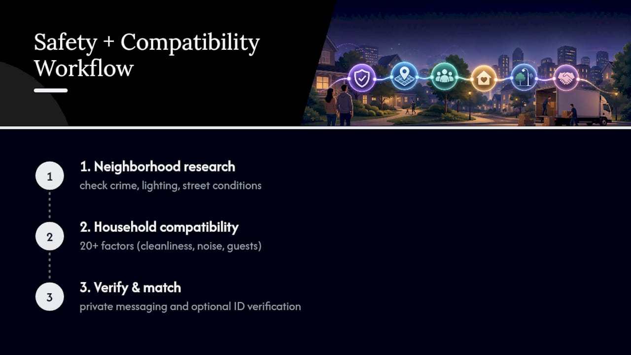
Neighborhood research doesn’t stop once you’ve picked a zip code. It has to extend into who you’re actually going to live with, because a safe block and a mismatched household can still make your daily life feel unstable. That’s the gap Roomitai was built to close: matching people using more than 20 structured lifestyle and household factors, from cleanliness habits to noise tolerance to guest policies, so the compatibility work happens alongside the location work, not after it.
A quiet, well-lit street loses a lot of its value if your housemate keeps odd hours, hosts guests without warning, or ignores shared-space upkeep. We’d argue the safety checklist you run on a neighborhood deserves a companion checklist for the people you’re about to share a home with. Cleanliness standards and noise expectations aren’t just preferences; they shape whether a home feels secure day to day, in the same way sidewalk lighting shapes whether a block does.
If you’re weighing a listing, treat the neighborhood research above as step one and the household compatibility research as step two. Private messaging with optional verification allows users to ask direct questions about schedules and habits before committing to anything. Search compatible rooms and roommates on Roomitai once you’ve narrowed down a neighborhood that checks out on both the data and the sidewalk.
Primary Sources Worth Bookmarking
Keep these on hand any time you start researching a new area, and check the date stamp on each before trusting the numbers.
- Neighborhood safety concerns and daily well-being: A national diary study, best for understanding the wellbeing stakes behind the research.
- What predicts how safe people feel in their neighborhoods and does it depend on functional status?, best for understanding which built-environment factors to prioritize.
- Portland Police Bureau reported crime data, a model example of a municipal dashboard with neighborhood and date filters.
- FBI reported crimes in the nation statistics, best for national and regional baseline comparisons.
Before you rely on any dashboard, confirm the last update date and double check which boundary or filter set it’s using. A neighborhood dashboard that hasn’t refreshed in three months isn’t giving you last month’s picture; it’s giving you an old one.
Why Crime Statistics Alone Miss What Makes a Neighborhood Feel Safe
Most people research a neighborhood the way they’d research a used car: check the numbers, run a report, call it done. That instinct is understandable, but the research doesn’t support it. Perceived safety turns out to be a genuinely different variable from crime rate, tied closely to whether sidewalks are intact and streetlights work, not just whether a police blotter is quiet.

What surprises people most is the functional-status finding: infrastructure quality doesn’t affect everyone equally. If you’re renting for yourself and healthy, a broken sidewalk might barely register. If you’re renting with an aging parent or a mobility aid, that same sidewalk could be the deciding factor, outweighing a modestly higher crime rate in a better-maintained area nearby.
The other blind spot is treating a single crime dashboard as the finish line. Municipal data is the best starting point available, genuinely, but it measures reported incidents in a specific boundary during a specific window, nothing more. It can’t tell you whether the block feels different at 9 p.m. than it does at 9 a.m., and it can’t tell you whether your future neighbors actually talk to each other. That’s information you have to go collect yourself, on foot, at the hour you’d actually be walking there.
— Salem
Sources
Start local, then zoom out. Municipal crime dashboards give you the granular, block-level detail that no national database can match. Portland’s police department publishes an interactive reported-crime dashboard that lets residents filter by neighborhood, council district, offense category, and date range, updated on a roughly monthly cadence. Most mid-size and large cities run something similar. That local detail is exactly why you should treat a municipal dashboard as your first stop, not a national statistic.
Here’s how the major source types stack up:
- Neighborhood safety concerns and daily well-being: A national diary study
- What predicts how safe people feel in their neighborhoods and does it depend on functional status?
- Portland Police Bureau reported crime data interactive reports
- FBI releases 2024 reported crimes in the nation statistics
When you open a dashboard like Portland’s, use the filters deliberately:
FAQ
Is There a Way to Check if a Neighborhood Is Safe?
Yes. Start with your city’s municipal crime dashboard, like Portland’s reported crime data, to see local incident types and trends, then convert raw counts into population-adjusted rates for a fair comparison. Follow that up with an in-person visit at different times of day to check lighting, foot traffic, and upkeep, since those factors shape perceived safety as much as crime statistics do.
What Is the Safest Area in Mobile, Alabama?
Rankings of specific neighborhoods change as new crime data is published, so the most reliable answer is to pull current data directly from a local or state law enforcement dashboard rather than relying on a fixed list. Compare population-adjusted crime rates across Mobile’s neighborhoods using the most recent 12-month window available, then validate the results with a field visit.
What Is the Number One Safest City in the US?
City safety rankings shift year to year depending on the data source, the crime categories included, and how population is factored in, so there’s no single definitive answer that holds indefinitely. Rather than chasing a “number one” title, compare population-adjusted rates for the specific cities or neighborhoods you’re actually considering, using the FBI’s national reported crime data as your baseline.
How Reliable Is NeighborhoodScout?
Third-party neighborhood scoring tools can offer a useful starting snapshot, but they typically rely on modeled estimates and aggregated data rather than the live, incident-level detail municipal dashboards provide. Treat any third-party score as a preliminary filter, then confirm the picture with your city’s own crime dashboard and an in-person visit before drawing conclusions.
Recommended
Find a roommate you'll actually get along with
Roomit is preparing compatibility-first matching city by city. Join your local waitlist.